Wednesday, 10 April 2013

Bon Voyage!

My new brief is to create a pattern & print.
The theme is now decided to be a "nautical theme"

Just as it happeneds, I've seen an advert for Tommy Hilfiger, Spring Summer Collection 2013!

Here's the full advertisment!


I N S P I R A T I O N!

From seeing this, I want to create a garment and attend a photoshoot on a boat!! This is going to be difficult to do, but I'm determind to make this a success!

I have already emailed sombody about a boat in Liverpool, it turns out that the boat is no longer available :(

I will carry on the search, I'm currently thinking of Fiddlers Ferry, in Warrington Cheshire, here are some pictures of Fiddlers Ferry...


Wednesday, 20 March 2013

Templates


This font that says "ELIZA" is from Dafont, I felt that the font fit well with the image as its simple. A busy title would distract the buyers eye from the image itself. 


Before and After Photoshop!


 BEFORE:


This is the before shot. 
As you can see, the flooring on the bottom right is uneven and very loud. This distracts my photo as people will be drawn to the wrong part!


AFTER:


This is the after shot.
The flooring is the same throughout, which makes the photo look finished. 


Step 1: - I zoomed into the image and cut out the yellow tape, I then filled it with a sample of the colour of the original tiles to make it unnoticeable.

Step 2: - I then cropped a section out like this, and put it over the black section to make the floor continuous. 

Wednesday, 13 February 2013

HOW I EDITED THE IMAGES ON PHOTOSHOP!! 


 THE FIREPLACE...


This was the image to start off with. it was very dark and you couldn't see the waistcoat that I had produced. 


.....so I clicked on "Image" and then "Brightness and Contrast".


By moving the brightness lightly to the right which you can see the difference in the top right hand corner. I moved the contrast slightly to the left which didn't make the photo look "washed out", it kept the depth in the photo. 


I then clicked on "Image", then "Colour Balance", this gave me the opportunity to put a slight colour change on the photo. 


I moved the arrow on the first bar towards the 'RED' side. On the second bar I moved the arrow towards the "MAGENTA" to create an orangey colour, and then on the third bar I moved the arrow towards the "YELLOW" to highlight the lighter shades of the picture to make the image look rustic and old fashioned. 


                                                                   THE COTTAGE...


For the cottage image, I clicked "Image" in the top left hand corner and then clicked on "Adjustments" and then "Brightness and Contrast". This made the background look brighter, and fresh. 


     THE BACKSHOT....


Firstly I clicked on "Image", then "Adjustments" then "Brightness and Contrast", I moved the arrow to the right only very slightly to give  a "glow" to the photo. I kept the contrast more to the left, as I didn't want the photo to wash out detail from the fire place. 


For the next shot I clicked on "Image", then "Adjustments" and then "Hue and Saturation". This gave my image a not as bright look, to make the image look old fashioned.


And for the final change in the photo, I changed the Brightness and Contrast so that the image looks bright.

These are the photo's from my blue collar worker (one word) project. 
I have photoshopped them for the Magazine brief. 


BEFORE

AFTER

BEFORE

AFTER

BEFORE

AFTER

Wednesday, 19 December 2012

As I am making a Blue Collar workers waist coat for my project, I wanted to put a twist on the styling.
I am going to make the waistcoat to fit a man, male measurements, and then put the waistcoat on a female model, but style the female model, to look like a boy.

Here are some images that have inspired me:

This is an image of Queen Of Pop, Madonna. This image inspired me, as the boyish stance creates a different look to the photo. Also, the fag in her hand shows an un lady-like look. 


Wednesday, 14 November 2012

Mood Boards -

I have to create 2 mood boards, one Primary and the other secondary. This mood board is secondary as my images are all off the internet.

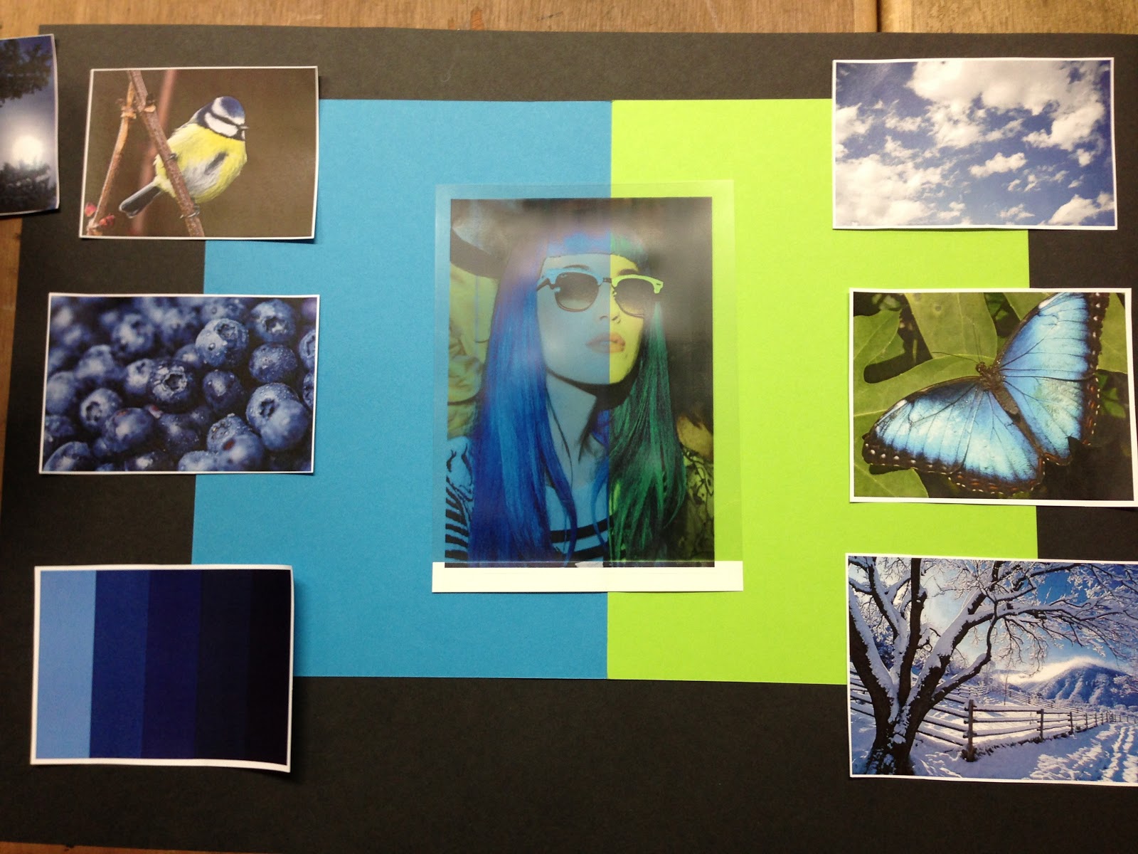
I collected nature images, as "Blue" is a Primary colour, I thought that the natural images would reflect the primary colour.

This is my chosen Mood Board. It took me a while to get it, but I played around with the images and card, and created a board to reflect the colour "Blue". The middle photo is acetate, I placed two pieces of card behind it to create a block coloured effect, almost quite abstract.
This is my favourite mood board as it has all of the elements on it, such as the colour palette, which indicates what specific colours I want to get across, also, I have a lot of nature photos, which have connotations of "Natural", "Everyday Life".
I put the lime green piece of card behind the acetate next to the blue to add more colour into the mood board as the blue looked too much, and almost "Cliche".


Mood Board Design No.1 -
This mood board had a modern design. As the blank space in the top corner leaves a space for the imagination. On this mood board there is no human photo's, which could pursue the wrong message that I'm trying to get across!

Mood Board Design No.2 - 
On this Mood Board I wanted to make it look symmetrical. But I found it difficult to look at the images as they were all on an angle.

Mood Board Design No.3 
On this mood board I feel that the background is too harsh and dark against the bright pictures.
I like the "cross" effect, as it connects all the images together like a time line or story line.

Mood Board Design No.4
On this Mood Board I thought "Less is more" but realistically, I wanted quite a busy mood board to get the message across clearly. I thought it was good to have a variation on the different styles I created to finally get the one I wanted!