Thursday, 18 July 2013
FASHION COMP
https://www.facebook.com/photo.php?fbid=10152025867674196&set=a.10152025864719196.1073741845.26499439195&type=1&theater
Hi everyone!!
I'VE BEEN ENTERED INTO A FASHION DESIGN COMPETITION IN WARRINGTON CHESHIRE, AND I WOULD REALLY APPRECIATE YOUR VOTES TO HELP ME WIN!
ALL YOU HAVE TO DO IS CLICK ON THE LINK ABOVE AND LIKE THE IMAGE OF MYSELF STOOD WITH MY GARMENT.
THANKS TO EVERYONE XO
Friday, 14 June 2013
Templates
This is a rough template of my front cover and magazine spread, I did this to help me and remind me what I need to include during the process


Step By Step for the spread - illustrator

2. Then I picked a photo to put on the left hand side of the page, and measured it to fit the page. As my image wasn't an A4 size the image could not be shrunk down to fit.

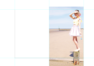
This is the image for the left hand side of the spread, it doesn't show my garment off, but i have taken the photo itself and i think it fits with the theme.

The left hand side I wanted a coloured background, I chosen a bright pink to add contrast and juxtapose the light pale picture on the right hand side.

I then placed the image on top of the bright pink and just thought the colour looked too harsh along side the other image.

I then changed the background to a baby sky blue to make it not look as harsh/hard on against the other image.

I then tried the baby pink colour, and I thought it looked miles better than the blue.

...So then I made the photo fit against the page perfectly so there was no border around the image.

I downloaded the font from DAFONT.com and thought it fit perfectly with the sea side theme.

I was unsure where to place the title, so i tried it at the bottom under the fair ground ride image and it just didn't seem to look right.

...So I tried it in the sky on the right hand side picture, in a bright candy pink colour and I thought it looked more professional.


I then started to write in collumns on the photo in the background so the writing doesn't interfere with the background.
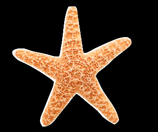
I then went on Google Images and searched for a picture of a starfish and cut it out using a tool on photoshop.

This is the final outcome of the magazine spread.
Overall I feel that the final piece looks colourful and neat.
I've tried my best to show off my skills in photoshop by editing photo's to look their full potential and cutting images out.
The Front Cover and Magazine spread

This is my official magazine spead, I chosen font number 1, and used a QR code that links straight to my blog. I put the QR code on the front page as it's something the public will see and use, they don't have to look through the pages to find the code, as it's just on the front.

For my front cover I went on DAFONT.com, and found 3 chosen fonts for the headline of my cover, so I peer assessed and this was the outcome:
Font one: IIIIII Font two: III Font three: II

This was my favouriate font, as it's simple and kurning.
The detail on the font is simple yet effective which gives a sense of sophistication.

I find this font very circus like and retro, but the only
problem I discovered was that it was too fussy and blended
into the picture.

I felt that this font was simple and to the point,
but the font itself is too hard on the background image and doesn't suit it.
Wednesday, 22 May 2013
The Magazine Original Cover

This is the "G L A Z E" front cover, I have kerned the font, as it looked squashed together just normally.
I did this just by putting a double space in between the letters.
I chosen white as there is a lot of pastel shades in this cover and couldn't see black/grey/ or pink very well. So I chose white, I feel this has a clean look, and fits in with the soft colour palette.
Subscribe to:
Posts (Atom)