Wednesday, 13 February 2013

HOW I EDITED THE IMAGES ON PHOTOSHOP!! 


 THE FIREPLACE...


This was the image to start off with. it was very dark and you couldn't see the waistcoat that I had produced. 


.....so I clicked on "Image" and then "Brightness and Contrast".


By moving the brightness lightly to the right which you can see the difference in the top right hand corner. I moved the contrast slightly to the left which didn't make the photo look "washed out", it kept the depth in the photo. 


I then clicked on "Image", then "Colour Balance", this gave me the opportunity to put a slight colour change on the photo. 


I moved the arrow on the first bar towards the 'RED' side. On the second bar I moved the arrow towards the "MAGENTA" to create an orangey colour, and then on the third bar I moved the arrow towards the "YELLOW" to highlight the lighter shades of the picture to make the image look rustic and old fashioned. 


                                                                   THE COTTAGE...


For the cottage image, I clicked "Image" in the top left hand corner and then clicked on "Adjustments" and then "Brightness and Contrast". This made the background look brighter, and fresh. 


     THE BACKSHOT....


Firstly I clicked on "Image", then "Adjustments" then "Brightness and Contrast", I moved the arrow to the right only very slightly to give  a "glow" to the photo. I kept the contrast more to the left, as I didn't want the photo to wash out detail from the fire place. 


For the next shot I clicked on "Image", then "Adjustments" and then "Hue and Saturation". This gave my image a not as bright look, to make the image look old fashioned.


And for the final change in the photo, I changed the Brightness and Contrast so that the image looks bright.

These are the photo's from my blue collar worker (one word) project. 
I have photoshopped them for the Magazine brief. 


BEFORE

AFTER

BEFORE

AFTER

BEFORE

AFTER

Wednesday, 19 December 2012

As I am making a Blue Collar workers waist coat for my project, I wanted to put a twist on the styling.
I am going to make the waistcoat to fit a man, male measurements, and then put the waistcoat on a female model, but style the female model, to look like a boy.

Here are some images that have inspired me:

This is an image of Queen Of Pop, Madonna. This image inspired me, as the boyish stance creates a different look to the photo. Also, the fag in her hand shows an un lady-like look. 


Wednesday, 14 November 2012

Mood Boards -

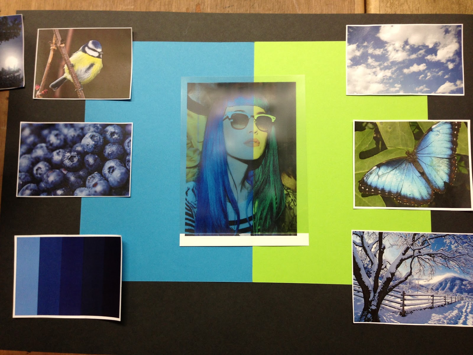
I have to create 2 mood boards, one Primary and the other secondary. This mood board is secondary as my images are all off the internet.

I collected nature images, as "Blue" is a Primary colour, I thought that the natural images would reflect the primary colour.

This is my chosen Mood Board. It took me a while to get it, but I played around with the images and card, and created a board to reflect the colour "Blue". The middle photo is acetate, I placed two pieces of card behind it to create a block coloured effect, almost quite abstract.
This is my favourite mood board as it has all of the elements on it, such as the colour palette, which indicates what specific colours I want to get across, also, I have a lot of nature photos, which have connotations of "Natural", "Everyday Life".
I put the lime green piece of card behind the acetate next to the blue to add more colour into the mood board as the blue looked too much, and almost "Cliche".


Mood Board Design No.1 -
This mood board had a modern design. As the blank space in the top corner leaves a space for the imagination. On this mood board there is no human photo's, which could pursue the wrong message that I'm trying to get across!

Mood Board Design No.2 - 
On this Mood Board I wanted to make it look symmetrical. But I found it difficult to look at the images as they were all on an angle.

Mood Board Design No.3 
On this mood board I feel that the background is too harsh and dark against the bright pictures.
I like the "cross" effect, as it connects all the images together like a time line or story line.

Mood Board Design No.4
On this Mood Board I thought "Less is more" but realistically, I wanted quite a busy mood board to get the message across clearly. I thought it was good to have a variation on the different styles I created to finally get the one I wanted!


YVES KLEIN - ARTIST

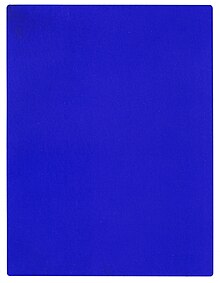
Yves Klein was a French Artist who became inspired by the colour "Colbalt Blue" used by Artist, Lapis Lazuli who was a renaissance period artist, the colour was used on the Virgin Mary's robes.

Yves Klein was inspired by this colour, he created 20 canvases with just the Colbalt Blue colour on the canvas.

When I was researching Yves Klein, the colour "Blue" was mentioned and the colour was shown as images. I thought he would be brilliant to add as one of my Artists, as he's recreated a colour from the past, this links with my project, as I'm recreating a waist coat from the past.


Attached Image: yves_klein.jpg

Attached Image: klein_yves.jpg
One Word: "Blue"

I came across this word as it was chosen from a bag, blind folded. When I received the colour "Blue" I was very happy, as before I got the brief I had an idea on what I wanted to make! I wanted to recreate a 1920s Blue Collar Worker Waistcoat. I wanted to make a men's wear garment to give my portfolio depth and variety. 

I peer assessed the colour "Blue" by asking my peers what they felt/thought when hearing the colour. Some of the answers I was very shocked at, this shows different peoples perception of the colour itself. 

Here are the answers I received:
- The Navy
- Nautical Wear
- Winter
- Sea
- Denim
- Masculine colour
- Colbalt Blue
- Mary/Religious
- Blues Music
- Blueberry
- Blue Collar Worker


After seeing these images, I thought differently about the colour "blue". 

I think it's great that people have different interpretations on the colour itself. 

I like the variety of points I can choose from, as I can go into depth on my project. 

In ways I have had too much choice, but the colour "Blue" is very broad. 

Wednesday, 7 November 2012


These images are the final images of my mini me doll I created!

As you can see, the images have a tint of red in the photo to make the image look old fashioned!
I did this effect on photoshop.


A close up of the head gives a scary feel to the photo, as the buttons are staring, also the dark shadow gives a sense of darkness and open to your imagination!