Wednesday, 19 December 2012

As I am making a Blue Collar workers waist coat for my project, I wanted to put a twist on the styling.
I am going to make the waistcoat to fit a man, male measurements, and then put the waistcoat on a female model, but style the female model, to look like a boy.

Here are some images that have inspired me:

This is an image of Queen Of Pop, Madonna. This image inspired me, as the boyish stance creates a different look to the photo. Also, the fag in her hand shows an un lady-like look. 


Wednesday, 14 November 2012

Mood Boards -

I have to create 2 mood boards, one Primary and the other secondary. This mood board is secondary as my images are all off the internet.

I collected nature images, as "Blue" is a Primary colour, I thought that the natural images would reflect the primary colour.

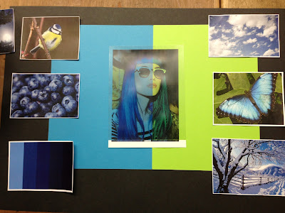
This is my chosen Mood Board. It took me a while to get it, but I played around with the images and card, and created a board to reflect the colour "Blue". The middle photo is acetate, I placed two pieces of card behind it to create a block coloured effect, almost quite abstract.
This is my favourite mood board as it has all of the elements on it, such as the colour palette, which indicates what specific colours I want to get across, also, I have a lot of nature photos, which have connotations of "Natural", "Everyday Life".
I put the lime green piece of card behind the acetate next to the blue to add more colour into the mood board as the blue looked too much, and almost "Cliche".


Mood Board Design No.1 -
This mood board had a modern design. As the blank space in the top corner leaves a space for the imagination. On this mood board there is no human photo's, which could pursue the wrong message that I'm trying to get across!

Mood Board Design No.2 - 
On this Mood Board I wanted to make it look symmetrical. But I found it difficult to look at the images as they were all on an angle.

Mood Board Design No.3 
On this mood board I feel that the background is too harsh and dark against the bright pictures.
I like the "cross" effect, as it connects all the images together like a time line or story line.

Mood Board Design No.4
On this Mood Board I thought "Less is more" but realistically, I wanted quite a busy mood board to get the message across clearly. I thought it was good to have a variation on the different styles I created to finally get the one I wanted!


YVES KLEIN - ARTIST

Yves Klein was a French Artist who became inspired by the colour "Colbalt Blue" used by Artist, Lapis Lazuli who was a renaissance period artist, the colour was used on the Virgin Mary's robes.

Yves Klein was inspired by this colour, he created 20 canvases with just the Colbalt Blue colour on the canvas.

When I was researching Yves Klein, the colour "Blue" was mentioned and the colour was shown as images. I thought he would be brilliant to add as one of my Artists, as he's recreated a colour from the past, this links with my project, as I'm recreating a waist coat from the past.


Attached Image: yves_klein.jpg

Attached Image: klein_yves.jpg
One Word: "Blue"

I came across this word as it was chosen from a bag, blind folded. When I received the colour "Blue" I was very happy, as before I got the brief I had an idea on what I wanted to make! I wanted to recreate a 1920s Blue Collar Worker Waistcoat. I wanted to make a men's wear garment to give my portfolio depth and variety. 

I peer assessed the colour "Blue" by asking my peers what they felt/thought when hearing the colour. Some of the answers I was very shocked at, this shows different peoples perception of the colour itself. 

Here are the answers I received:
- The Navy
- Nautical Wear
- Winter
- Sea
- Denim
- Masculine colour
- Colbalt Blue
- Mary/Religious
- Blues Music
- Blueberry
- Blue Collar Worker


After seeing these images, I thought differently about the colour "blue". 

I think it's great that people have different interpretations on the colour itself. 

I like the variety of points I can choose from, as I can go into depth on my project. 

In ways I have had too much choice, but the colour "Blue" is very broad. 

Wednesday, 7 November 2012


These images are the final images of my mini me doll I created!

As you can see, the images have a tint of red in the photo to make the image look old fashioned!
I did this effect on photoshop.


A close up of the head gives a scary feel to the photo, as the buttons are staring, also the dark shadow gives a sense of darkness and open to your imagination! 


I have created 2 moodboards. The first mood board is a about my childhood! 
I have put all the images in black and white as I wanted the images to look old fashioned as the mood board is throughout my childhood! 


The second mood board is about myself now aged 17!
My favourite colour palette is pastel shades. Make-up, and food. 


The two different mood boards juxtapose each other, from:
- The Colour Scheme
- Make-up
- But also elements in the second mood board has childish photo's in, such as ice-cream and cup cakes, this suggests that I still look back on my childhood. 

"mini me" - Research! Along the internet I searched for Designers Victor & Rolf. I discovered that the dolls they created became a big hit with other Fashion Designers and public! Making mini garments are good as designers don't want to waste expensive fabrics making dresses if they didn't like the designs after they've been produced.
Here these photo's show the dolls finally made and then being shown into a full garment after being approved! The dolls are porcelain to look expensive.
This image shows the Viktor and Rolf House of Dolls! Over the years the collection has grown.

Wednesday, 31 October 2012

The next brief for my college project, is "mini me", this brief consists of: - About my self - My Fashion history and Fashion now - Jewellery - Music tastes - Colours. For this project I will be creating a 3 mood boards, to show my interests. I will also be drawing 5 designs, (Fashion Illustrations) to show key ideas. I've gathered a few photo's together to show my likes and dislikes to show my personality.
I like the British sea side, I think it holds a lot of history in Britain, it's full of my childhood memories!
I really like the brand "Burberry" as he clothing is so simple yet unique. The male model in the photo is "George Craig", from one of my favourite bands, "One Night Only", and now part time models for Burberry.
I think he's a great model, as his musical background reflects on the Fashion World. I look up to him as he demonstrates the look for a male model, which helps me gain confidence on picking future models in the future.

Monday, 29 October 2012

Evaluation

Introduction:
My brief was to create a garment from recycled materials. When I brain stormed my ideas, I realised that I didn't want to do a cliche material such as “Plastic bags”, “Cans” and “Foods”. To put a twist on my recycled project, I picked a chosen era to make my project structured. The 1950’s and 70’s was an era that I felt I could create a garment with no limits.

Influences:
As I based my project on the 50’s era to create depth into my work, I researched famous models and actors from the 50’s and 70’s to clash them together.

Exploration:
For my project I wanted to create/ make a petticoat, and over-skirt.
I required to make the petticoat out of net curtains from the charity shops.
I went to TP Textiles and looked through the cut off bin (Scrap bins) and I found a red and white polka dot shiny material (2 meters), and a thick calico material for the under skirt base (2 meters).

Evaluation:
Firstly, I started to research into designers and artists that are inspired by “recycle” made items. This gave me inspiration and a different outlook on the fashion industry throughout recycling.
The designer that had the biggest impact on my work was “Reem Alasadri”, her work inspired me as the whole point of recycling wasn't the cliche “Cans”, “plastic”. She went out to charity shops and markets all around Britain to create clothing into something completely different, also it gives a retro or vintage feel to her work, which is something I definitely wanted to introduce in my work, l especially the “retro” side of it. The research side of the project was very interesting as I received information that inspired me.
When making the garment I discovered that I the top skirt (The polka dot material) was very hard to sew! Especially on the sewing machine as the fabric snagged and made the material fray. To reduce this happening, I hand stitched the hem line on the top skirt. The zip was surprisingly straight forward to put in the top skirt. I hand tacked it onto the material first, and then went over it with the sewing machine, as the zip needed to be secure.
For the underskirt, I used thick elastic to be sewn onto the waistband; I didn't apply a zip into the calico underskirt as it would be hidden under the polka dot material.
When sewing the net curtain pieces onto the underskirt, I gathered each piece of netting to create a ruffled effect, to make the petticoat look fluffy.

Conclusion
Overall, I enjoyed making the garment and I am pleased with the end result
to show off  my garment I created a photo shoot and styled the hair, make up, and posture of my model. I did a photo shoot to show the best qualities of my garment. The photo shoot was very enjoyable; I enjoyed leading a team and styling the image. It is something I will definitely look into in the future.  

Wednesday, 17 October 2012

Recycle Project - Moodboards

This MoodBoard is based on the Recycle side of the project. This gave me inspiration on different textures I could use and materials.
This MoodBoard is based on the theme of my project, the 1950's. I chosen to do two different MoodBoards as my project had alot of depth into it, and was easy to break down.

Wednesday, 10 October 2012

1950's American Diner Photo Shoot

Designed/Made/Stylist/Art Directed - Amy Smith

Photographed by Stephen Maycock


The clash of all the patterns in this shot are a little crazy, but in the 1950's, everybody got carried away with pattern and print, as it was all a new discovery, in a way it all works well together.
This shot is one of my favouriates, as you can see the petticoat I made, the ruffles look even and tidy.
I told my model to act very flirty whilst acting this shoot, as I feel Women in the 50's became very dominant and knew they could win Males over, by flirting!

-----------
     
This photograph was a head shot. Even though this photo doesn't show off the skirt I produced, I styled the model's hair and make-up, also, I chosen the white blouse to go with the polka-dot skirt, and the bright red pussy bow to add extra effect!
Red lips symbolise 'sexy' 'flirty', also with the splash of red in the bow, and the polka dots on the skirt, I thought it would finish the look off!

   --------------


This shot is all about the props!
When I was finishing the last touches on Jessica (The Model) I asked the owner of the diner if he could whip up a Milk-Shake!
I feel the Milk-Shake gave my photoshoot that extra thing to observe!

----------------

Please feel free to comment :)


I made the 1950's circle skirt, and located the photo shoot in Afflecks Palace, Manchester.
The photographer was Stephen Maycock. I chosen this setting for the shoot, because it was set out like an American Diner.

Monday, 2 July 2012

Candy-Floss Fashion Photo Shoot July 2012!

My brief was to create a Candy Floss Dress,  I chosen pink tule netting to create a girly childlike dress.


I enjoyed Art Directing this shoot, as the model was easy to work with, as the theme was 'sweets', the experience was enjoyable. This was my first photo shoot and I found that it gave me inspiration and confidence to explore photography in further projects.

Sunday, 1 July 2012


For inspiration for my Candy Project, I researched Louis Vuitton's pastel collection. The colour palette matches my shoot. 

 
 I went to an old sweet shop in Warrington Market and took this photo. This inspired me as the colours are very loud, which juxtaposes the Louis Vuitton image above!